
- Published on
The R-Squared Trap: When Cleaning Backfires
- Authors

- Name
- Isacar Racine
- @isacarracine
I removed 53 outliers from a laptop pricing model.
R-squared went from 0.818 to 0.856. Typical error dropped 15%. Every number in the output said the model had improved.
Then I scored it on data it had never seen. Error had gone up.
Cleaning the data made the model worse and made the numbers look better. Nothing warned me, because the numbers that improved were all measured on the rows I kept.
Part 4 of a six-part series on regression. Previously: how to read a regression coefficient.
What just happened
Delete the 53 and refit:
| With all rows | Outliers removed | |
|---|---|---|
| R-squared | 0.8180 | 0.8556 |
| Typical error | 3.233 | 2.758 |
Better on every count. Now score both on the 20% of the data neither model ever saw:
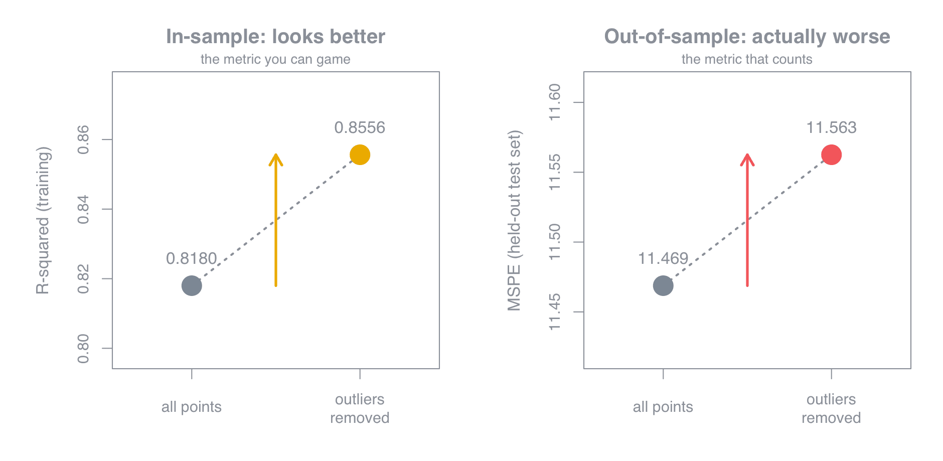
Both numbers went up. One of those is good news and the other is bad, and only the second was measured on rows the model hadn't already seen.
The mechanism isn't mysterious. R-squared is computed on the rows you trained on. Delete the rows the model handles worst and it rises automatically, whether or not those rows deserved deleting.
I hadn't improved the model. I'd removed the evidence that it struggles with certain laptops. Those laptops still exist in the world, and in the test set.
Were they even outliers? Reading Cook's distance
The rule I used flags any row whose Cook's distance exceeds 4 divided by the number of rows. Cook's distance asks: how much do all the predictions shift if I delete this one row?
cook <- cooks.distance(model)
sum(cook > 4 / nrow(data))     # 53
On 1,019 laptops it flagged 53. On a different model with 1,599 rows it flagged 93. That's 5.2% and 5.8% — suspiciously similar for two unrelated datasets.
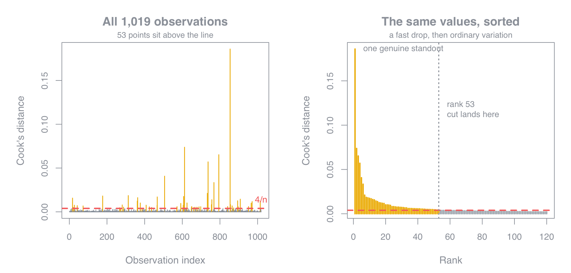
The sorted panel on the right is the one to read. There's a genuine standout at 0.186, roughly two and a half times the next value. Below it, five more between 0.033 and 0.074 are worth a look. After that the values decay smoothly with no gap anywhere, and the cutoff lands at rank 53, deep inside a stretch where every point looks like its neighbours.
So the data holds maybe six rows worth investigating. The rule returned 53.
By Cook's own original suggestion — flag anything above 1 — this dataset has zero outliers.
Outlier, leverage or influential? They're not the same
Outliers get talked about as one thing. They're three:
| Name | What's unusual | Does it matter? |
|---|---|---|
| Outlier | The outcome. Sits far off the line vertically. | Often not |
| High leverage | The inputs. Sits far from everything else horizontally. | Only combined with the above |
| Influential | Removing it visibly changes the model | This is the one you care about |
A point far out on the edge that lands right on the trend is harmless. A point in the middle of the pack with a big miss gets outvoted by its neighbours. Damage needs both at once.
So the real test isn't what happened to R-squared. It's whether the coefficients moved:
| Coefficient | With outliers | Removed |
|---|---|---|
| Ram | 0.3339 | 0.3669 |
| Ppi | 0.02612 | 0.02476 |
| SSD | 0.007399 | 0.007323 |
| Cpu i7 | 6.031 | 6.710 |
Same signs, same neighbourhoods. Nothing there changes a recommendation.
Those 53 rows were outliers and were not influential. They had big misses and weren't steering anything. Deleting them accomplished nothing except improving a number that can't see the test set.
Two coefficients did lose significance, but that's the cost of throwing away 53 rows of evidence, not an effect disappearing.
AIC and BIC play the same trick
After cleaning, I compared the two models properly, or so I thought:
| AIC | BIC | |
|---|---|---|
| Trained on all 1,019 rows | 5302 | 5401 |
| Trained on the cleaned 966 | 4720 | 4817 |
The cleaned model looks dramatically better. It isn't comparable at all.
Both scores are built by summing across rows. Fewer rows means a smaller sum means a better-looking score, independent of quality. Drop enough rows and any model beats any other.
That's three numbers now — R-squared, typical error, AIC — that all improved because I deleted rows. None of them could have told me the truth, because none of them can see the rows that are gone.
Should you remove outliers? What to do instead
- Look at them. Pull the flagged rows and read them. A laptop weighing 0.02 kg is a typo. A workstation at four times the median price is a real product.
- Fix what's broken, keep what's real. Correct or drop genuine errors and write down what you did. Extreme-but-real observations stay.
- If real outliers hurt the fit, change the model, not the data. Heavy tails usually mean a missing column, a response that needs rescaling (part 2), or a case for robust regression, which down-weights extremes instead of deleting them.
- Validate on held-out data. It's the only check that deletion can't game.
VIF and GVIF: one more diagnostic that misleads
Different problem, same lesson: a number that looks like it clears a threshold, and doesn't.
The variance inflation factor measures how much wider a coefficient's error bar gets because that column overlaps with the others. Above 10 is the usual line for trouble. But run it on a model containing categories and the output changes shape:
            GVIF       Df  GVIF^(1/(2*Df))
TypeName    13.229923  5   1.294660
Ram          2.869978  1   1.694101
Cpu_brand    3.548901  4   1.171552
TypeName reads 13.23, which looks well past 10. It isn't, and the reason is in the column headers. I have misread this exact table before.
A category with six levels becomes five separate switches, and GVIF grows with the number of switches. A big value says "this is a wide category," not "this is redundant." The comparable number is the third column, scaled to sit on the same footing regardless of width. Square it to compare against 10:
1.294660 squared = 1.68
Comfortably under. TypeName is fine.
Six things worth remembering
- Every in-sample number improves when you delete the worst-fitting rows. R-squared, typical error and AIC all did.
- Only held-out data can tell you whether cleaning helped. It's the one check deletion can't game.
- A count of flagged points is not a finding. Look for a gap in the sorted plot, not a threshold crossing.
- Outlier, high leverage and influential are three different things. Only the third matters, and it needs both of the first two.
- Check the coefficients, not the fit. If they barely move, the rows weren't steering anything.
- AIC and BIC compare models fitted to identical rows. Nothing else.
Previous: How to read a regression coefficient · Next: How to read logistic regression output
See also: 15 ways to misread your own regression model.
Get the next one
Posts on data, analytics and the judgment calls that decide whether a model gets trusted.