
- Published on
Why Care About Regression Assumptions?
- Authors

- Name
- Isacar Racine
- @isacarracine
Every regression ends with a number going in front of someone. A deck, a report, a decision.
The problem is that regression hands you the same clean output whether that number is trustworthy or not. Same coefficient, same p-value, same tidy interval. No warning, no error, no hint that anything is off.
Checking the assumptions is how you find out. It takes about two minutes, and it decides which of these three you are entitled to say:
- "Each extra bedroom adds $12,000."
- "And it's statistically significant."
- "We expect somewhere between 40 and 60."
Three different claims, resting on different footings. One broken assumption kills the first outright. A different one leaves the first standing and takes out the other two instead.
So when a diagnostic plot looks off, the useful question is not "is my model broken?" It is "which of those three sentences did I just lose?"
Part 2 of a six-part series on regression. Previously: what "we ran a regression" actually means.
The four regression assumptions, in plain terms
Every regression makes four promises, and all four are about the same thing: the gaps between what actually happened and what the model predicted.
Real car got 30 mpg. Model said 27. Gap of 3.
Those gaps have a name, residuals, and they are where every problem shows up. The fitted line always looks reasonable. The gaps are what give it away.
Here are the four promises:
| # | The assumption | The promise, in English | What a broken one looks like |
|---|---|---|---|
| 1 | Linearity | The real relationship is a straight line, not a curve | The gaps curve |
| 2 | Constant variance | The gaps are about the same size everywhere | The gaps fan out |
| 3 | Independence | One row's gap tells you nothing about the next row's | Gaps of the same sign clump together |
| 4 | Normality | The gaps pile up in a bell shape | The ends of the QQ plot bend away |
Those visual tells are how you go from "this plot looks wrong" to "assumption 2 broke," which is the move the rest of this post depends on.
Two of those have intimidating names you'll meet elsewhere. Homoskedasticity just means number 2 holds: the spread stays put. Heteroskedasticity means it doesn't, usually fanning out as the predictions get bigger.
Why it matters which one broke
Each promise protects a different one of those three sentences:
| Assumption | Which sentence it protects | What you lose if it breaks |
|---|---|---|
| Linearity | "Each extra bedroom adds $12,000" | The coefficient itself. It measures the wrong thing. |
| Constant variance | "It's significant", "between 40 and 60" | Your p-values and intervals. The coefficient survives. |
| Independence | The same two | Same, usually worse. Error bars come out too small. |
| Normality | The same two, on small samples | Very little, once you have a few hundred rows. |
Read the right-hand column again. Only the first one threatens your coefficients. The other three threaten the uncertainty around them.
Broken independence deserves a note: it usually shrinks your error bars rather than widening them, so p-values come out too small and things look more significant than they are. There is also one case where it does break the coefficients, and it is worth knowing if you work with time series: a model that predicts today from yesterday's value of the same thing, with correlated gaps, is biased rather than merely inefficient.
So a broken constant-variance promise means "my effect sizes stand, my significance claims don't." A broken linearity promise means "start over." That is a five-second decision once you can name which one failed.
Normality is the one to worry about least. It matters when you have twenty rows. At sixteen hundred, a bit of skew in the gaps will not move your conclusions.
How to check regression assumptions in R: three plots
model  <- lm(quality ~ ., data = beer)
resids <- residuals(model)

plot(fitted(model), resids)      # shape and spread
qqnorm(resids); qqline(resids)   # bell-ness
hist(resids, 10)                 # sanity check
Here are the first two on a real model:
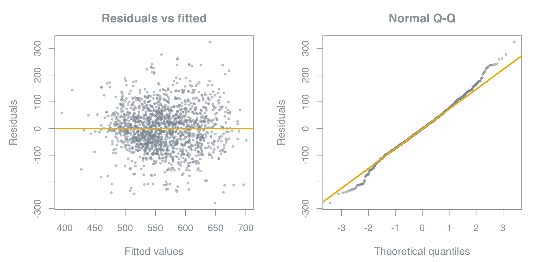
The left plot checks promises 1 and 2 at once. Does the band bend? That's linearity. Does it fan out or pinch in as you move right? That's constant variance. You want a shapeless horizontal smear, which is roughly what this is: no funnel, no bend, centred on zero throughout.
One trap before you judge that plot. The cloud looks narrower at the far left and far right, which reads like the spread shrinking. It isn't. There are simply fewer rows out at the extremes, so you see less of the tail. That's density, not variance, and it fools people constantly.
If you'd rather check than squint, split the fitted values into fifths and measure each one:
b <- cut(fitted(model), quantile(fitted(model), seq(0, 1, 0.2)), include.lowest = TRUE)
round(tapply(residuals(model), b, sd), 1)     # spread within each fifth
round(tapply(residuals(model), b, mean), 1)   # average gap within each fifth
On this model:
| Fifth of fitted values | Spread | Average gap |
|---|---|---|
| 395 to 521 | 73.3 | +5.8 |
| 521 to 547 | 72.7 | −6.0 |
| 547 to 573 | 79.8 | −1.6 |
| 573 to 606 | 86.2 | −3.4 |
| 606 to 701 | 87.5 | +5.2 |
Widest spread over narrowest is 1.2, so constant variance holds. The average gaps stay within ±6 on residuals that reach past ±300, so linearity holds too.
The right plot checks promise 4. A QQ plot sorts your gaps from smallest to largest and asks what a perfect bell curve would have produced in each position. Match, and the dots sit on the line.
Look at those bent ends. They mean the extremes are slightly fatter than a bell curve predicts, and at 1,599 rows that changes nothing. Bent tails are worth a glance, not a rewrite.
The histogram catches one thing the QQ plot hides: two humps. If your gaps have two separate peaks, you almost certainly left out a categorical variable that splits the data into two groups with different averages. That's a missing column, not a distribution problem.
Promise 3 needs a fourth plot, but only if your rows have an order. If the data is a time series, or arrived in a sequence that could matter, plot the gaps against that order:
plot(residuals(model), type = "b")   # look for runs of the same sign
lmtest::dwtest(model)                # Durbin-Watson: 2 is clean, under 1 is trouble
Runs of same-signed gaps mean consecutive rows are related. The Durbin-Watson test puts a number on it, running from 0 to 4, where 2 means no correlation and anything below 1 or above 3 is a problem.
If your rows have no natural order, there is nothing to plot, and independence becomes a fact about how the data was collected rather than something you can see. Repeated measures on the same person, students in the same classroom, customers in the same store: all break it by design, and only knowing the study will tell you.
Fixing heteroscedasticity (the fan shape)
This is the cheap one. When the gaps grow as the predictions grow, change the scale of the thing you're predicting. Which change depends on how fast the spread is growing:
| How the spread behaves | What to do to your response |
|---|---|
| Stays flat | Nothing. You're fine. |
| Grows like the square root | Take the square root |
| Grows in step with the prediction | Take the log |
| Grows faster still | Take one divided by it |
The middle case is the common one. Spread growing in step with level is the default behaviour of anything measured in money, counts, or population: prices, revenue, claim sizes, web traffic. That's why logs are everywhere.
Two things to keep straight. The transformation goes on the response, not the predictor, because that's where the gaps live. And it changes what your coefficient means: after logging the response, a coefficient is a percentage effect rather than an additive one. Don't carry the old sentence over.
The exact conversion is 100 * (exp(coefficient) - 1) percent. People often shortcut that to "multiply the coefficient by 100," which is close enough only while the coefficient stays under about 0.2. At 0.5 the shortcut says 50% and the truth is 65%.
One warning, from a mistake worth watching me make. I log-transformed a predictor that didn't need it and refit:
original:          R-squared = 0.1360
log(predictor):    R-squared = 0.1331
Slightly worse, which is exactly what should have happened. The relationship was already straight, so bending it could only hurt.
Fixing non-linearity (the curved residual plot)
This is the expensive one, because linearity is the promise whose failure breaks your coefficients. Options, roughly in order of how much readability they cost:
- Change the predictor's scale. Log, square root, one-over. Cheap, and the model stays easy to read.
- Add a squared term. Captures one bend. Past that you're usually fitting noise in the tails.
- Add an interaction. If the slope genuinely differs by group, this fixes it with no curve at all.
- Split the model. Sometimes two populations honestly need two models.
Five things worth remembering
- All four assumptions are about the gaps between what happened and what the model predicted.
- Linearity is the emergency. Break it and your coefficients are wrong. Break any other promise and only your error bars are.
- Broken constant variance means your p-values are wrong and your effect sizes are fine. That is a sentence you can say out loud in a meeting.
- Broken normality is the least urgent of the four. Bent QQ tails on a big sample are fine.
- Match the fix to the diagnosis. Shopping for transformations that raise R-squared is not diagnosis.
Previous: What "we ran a regression" actually means · Next: How to read a regression coefficient
See also: 15 ways to misread your own regression model.
Get the next one
Posts on data, analytics and the judgment calls that decide whether a model gets trusted.