
Georgia Tech · Data & visual analytics · 2022
SafeRide
A tool that scores how risky each NYC subway station is, built from 6.4M public crime records and tuned to what an individual rider actually worries about.
A team project. The report records equal contribution across all members, so what follows describes what the team built rather than any one person’s slice.
The problem
Nothing told NYC subway riders how risky a given station was. Crime data for the system is public, but it sits in millions of raw records that no rider is going to parse before deciding where to get off.
Risk is also personal. A commuter travelling alone at night and a parent travelling with a child weigh the same statistics differently, so a single "safety rating" would be the wrong answer. SafeRide instead lets the rider set what counts.
Scoring risk
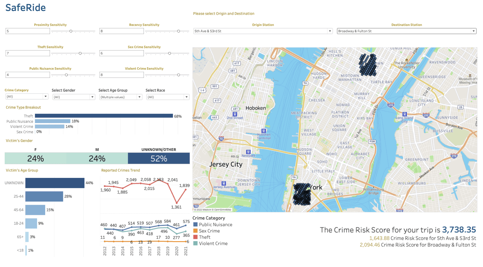
The Crime Risk Score aggregates reported crimes near a station, weighted by rider-set sensitivities to proximity, recency and crime type. Two models refine it beyond a simple local count:
- HDBSCAN clustering. Density-based clustering over arrest locations captures where crime genuinely concentrates city-wide, not just what falls inside a station’s radius. It contributes a global signal that a purely local count would miss. Clusters required at least 200 arrests, which keeps noise out.
- SARIMA forecasting. Monthly arrest history per crime category is forecast with a seasonal ARIMA and normalized into a 1–2 index that scales the score. Ten years of history showed clear seasonality, so a non-seasonal model would have missed the pattern. Parameters were grid-searched across 256 combinations and selected by lowest AIC.
- Rider-set weights. Proximity, recency and per-category sensitivity are all controls, alongside filters for crime type and victim demographics. The score was validated behaviourally: more nearby crimes, higher sensitivity, closer and more recent incidents each had to push the score up.
Making it usable
Most of the effort went into making 6.4M records respond fast enough to feel interactive:
- Vectorizing the distance join. The first pass used a geodesic library that produced a full cartesian product of stations against crimes — roughly 15 minutes per station. Replacing it with NumPy matrix subtraction over latitude and longitude, filtering by a bounding box before precise work, made the join tractable.
- Moving computation out of the front end. Calculating station-to-crime distances inside Tableau cost about 34 seconds on every parameter change. Precomputing the association in the Python ETL removed the wait entirely.
- Choosing the radius on evidence. A 440m radius loaded in 3–4 seconds on Tableau Public against 1–2 seconds at 220m, with no meaningful loss of relevant crimes. 220m won.
- Cleaning the source data. Stations were duplicated per entrance — 1,928 rows collapsed to 795 real stations by regex-matching corner suffixes and averaging coordinates. The 424 raw crime categories were reduced to four meaningful ones, and records older than ten years or with malformed coordinates were dropped.
A deliberate omission
Victim demographics — gender, age group, race — are available as filters, because who is targeted is information a rider can act on.
Offender demographics were deliberately excluded. The data exists, and using it would have been straightforward, but a tool that scores neighbourhoods by who commits crime there encodes racial prejudice into something presented as objective. The team left it out on purpose.
By the numbers
- 6.4M
- Crime records processed
- 795
- Subway stations scored, deduplicated from 1,928
- 34s → 0
- Wait on parameter change, after moving work to the ETL